Some products do not need a year-long brand transformation to become more desirable. Sometimes they need a clear idea, a strong packaging system, and a visual concept that can quickly turn an ordinary product into something people want to notice, collect, and share.
This project was built around that exact challenge: creating a fast packaging concept for a cookie line that could feel more memorable, more giftable, and more suitable for a collectible product release.
The Challenge: make a simple product feel collectible
Cookies are a familiar product category. People understand them instantly. But that also creates a problem: familiarity can make the product easy to ignore. For a collectible line, packaging needs to do more than protect the product or show the flavor. It has to create a reason to look twice.
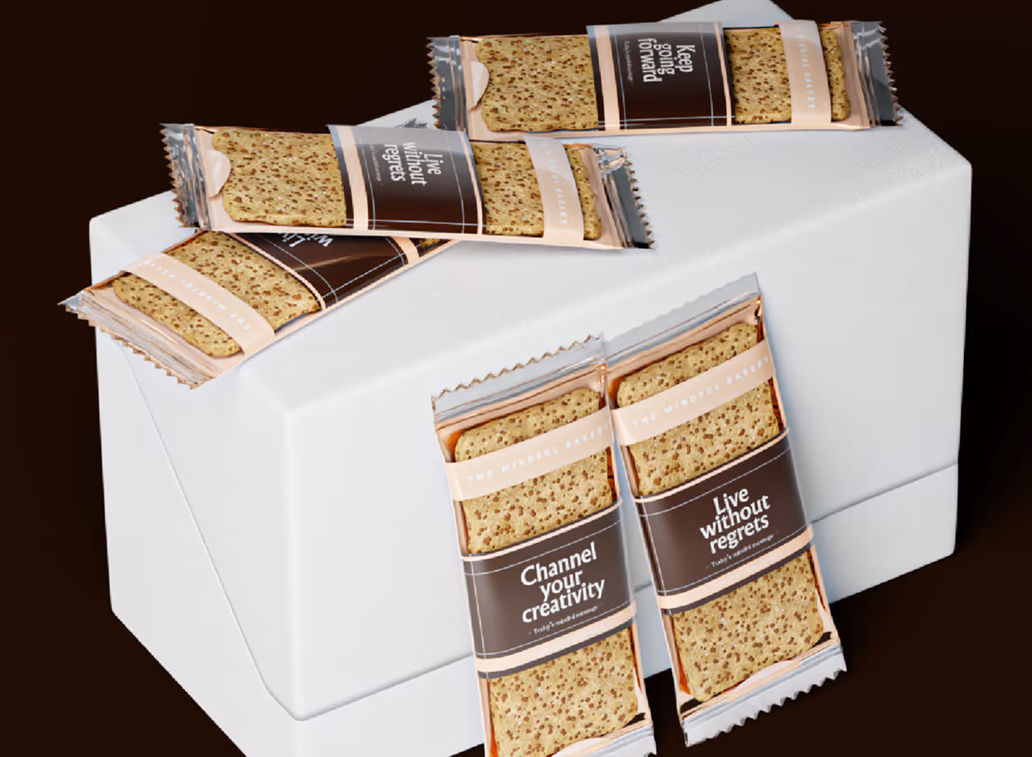
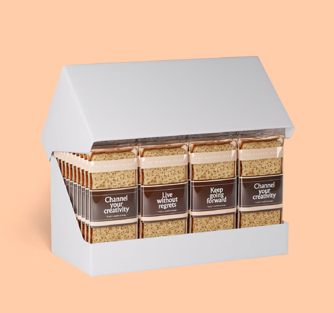
The design had to feel structured enough for a real product launch, but expressive enough to create a sense of edition, variation, and visual rhythm across the line. We approached the packaging as a system, not a single label.
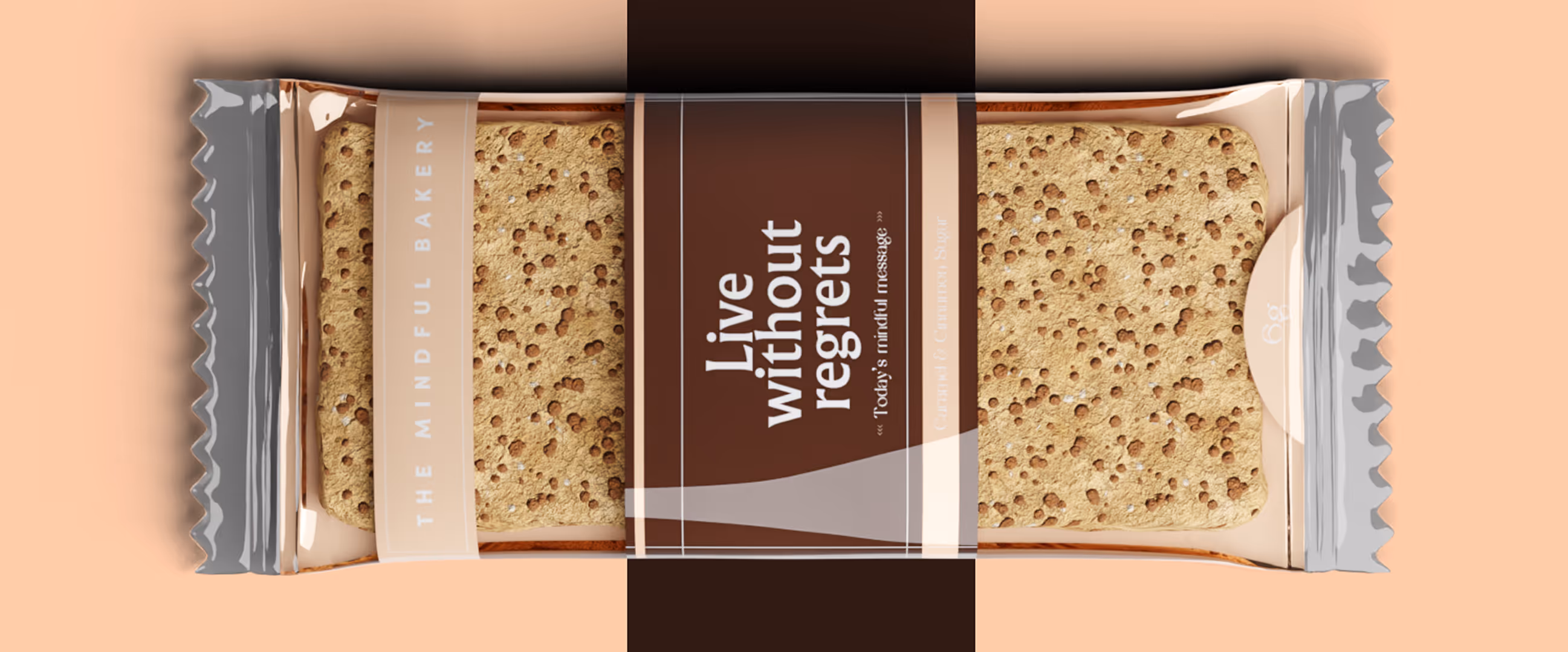
That means every decision had to support repeatability: the front composition, the typography, the visual field, the flavor logic, the product name, and the way multiple packs would look together as a family.
Strategic Direction: from cookie wrapper to small brand object
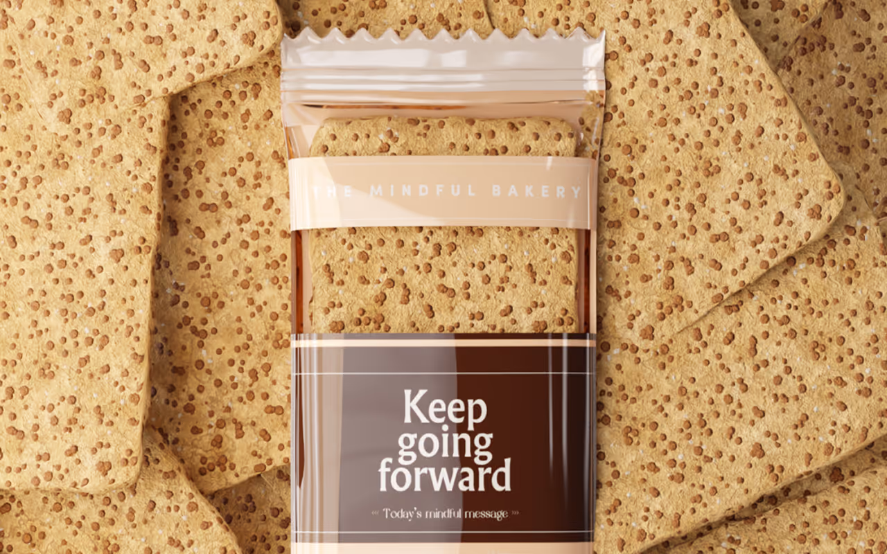
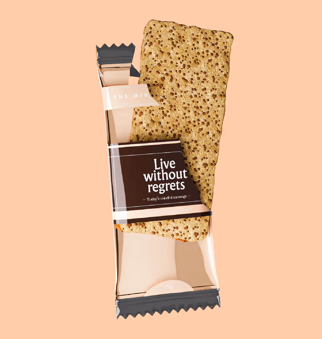
The central idea was to make the packaging feel like a small object of attention. The concept uses a calm visual system with a strong central message, tactile background textures, and a repeatable layout that can expand across different SKUs.
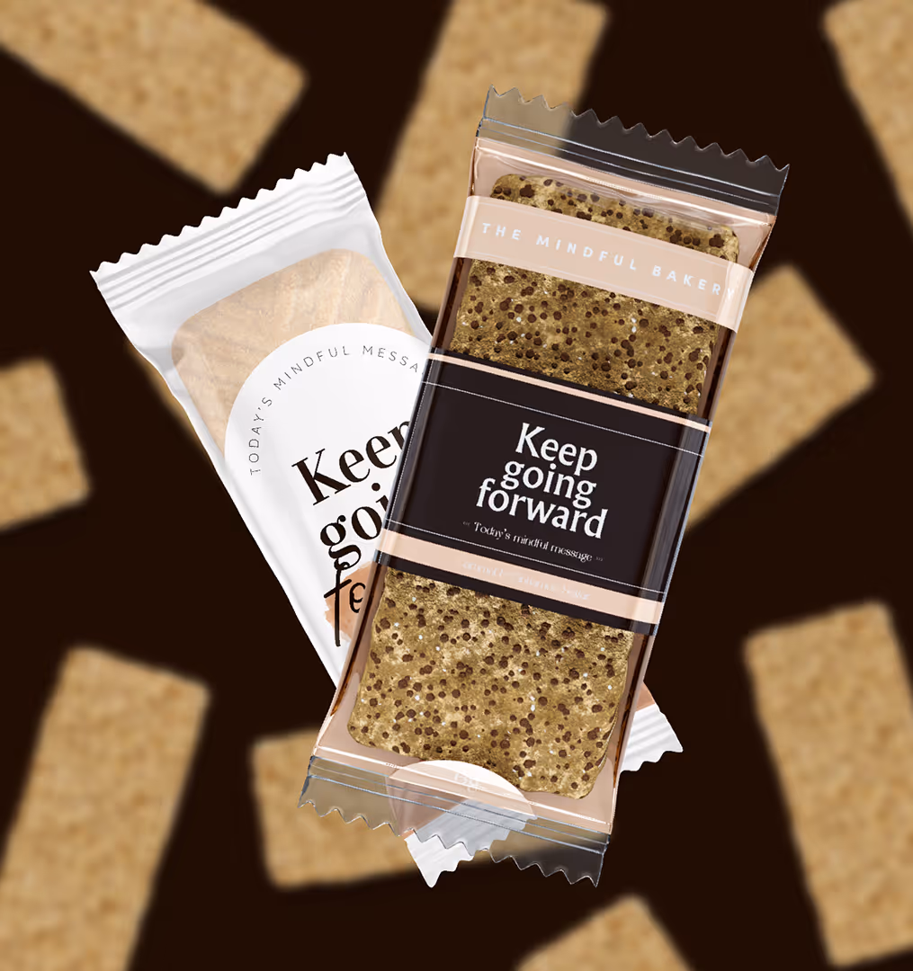
The phrase “Keep going forward” gives the packaging a simple emotional layer. It turns the product from a basic snack into a small moment of encouragement, something that can live naturally in a daily routine, a gift box, or a limited collection.
This type of message works especially well for collectible packaging because it gives the product more than a functional identity. It gives it a point of view.
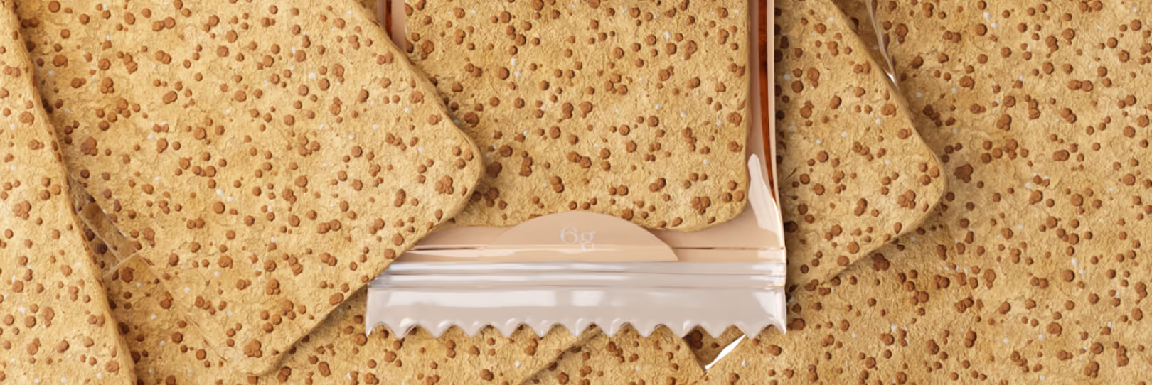
The packaging direction combines warmth with clarity. The cookie texture creates an immediate connection to the product itself. It feels edible, close, and tactile. At the same time, the central dark label creates contrast and gives the design a recognizable anchor. This contrast is important. Without structure, food packaging can easily become visually noisy. Without warmth, it can become too sterile. The design needed both: a sensory connection to the product and a clear branded center that remains readable across formats.
The system also works well as a collection because the main layout can stay consistent while details change. This allows the brand to build recognition without making every SKU look identical.