Strategic Direction: from AI Tool to story world
Before designing the visual system, we looked at the core role of the product. Talefy is not just a generator. It is not only a library of stories. It is a place where the user becomes part of the narrative.
That meant the brand needed to behave more like an entertainment world than a typical AI startup.
This is where the design thinking became important. We did not want to create one beautiful hero image and call it a brand. The goal was to create a visual language, a system that could expand across the website, product pages, social assets, story previews, campaigns, and future brand materials.
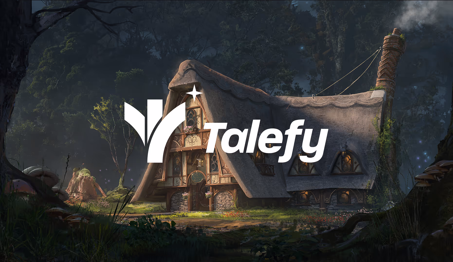
The Talefy logo needed to be simple enough to work as a digital product mark, but expressive enough to belong to a storytelling platform. The final direction combines a bold, readable wordmark with a symbol that feels open, upward, and narrative-driven. The mark suggests movement, pages, pathways, and discovery.
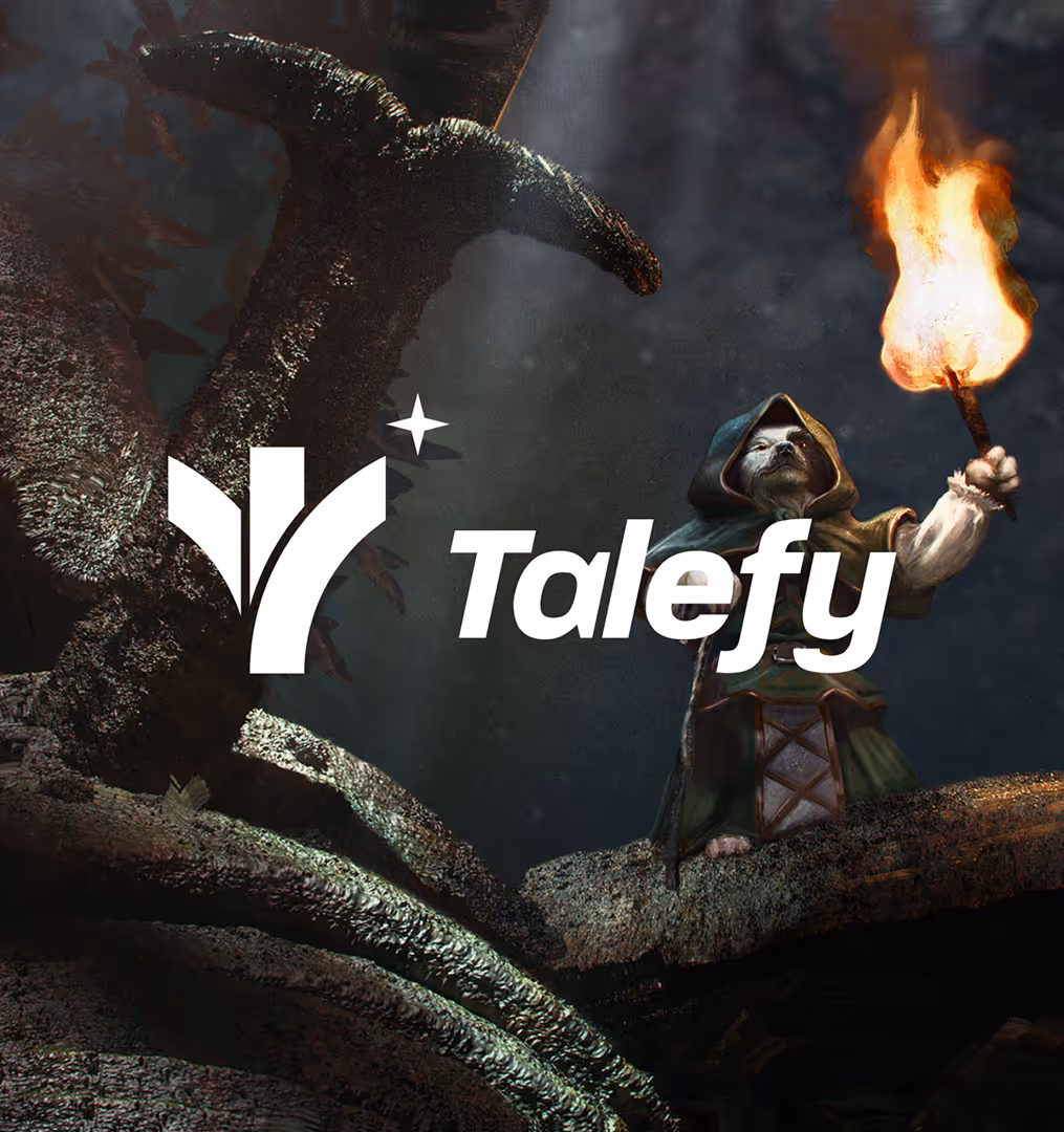
Platform is about stories, so the brand needed an environment. We leaned into cinematic, atmospheric visuals. The imagery supports the feeling of entering a story before the user even reads the copy.
Product is powered by AI, but the emotional hook is not the AI itself. The emotional hook is what AI allows the user to experience: stories that react, worlds that unfold, characters that respond, and creative control without a blank page.
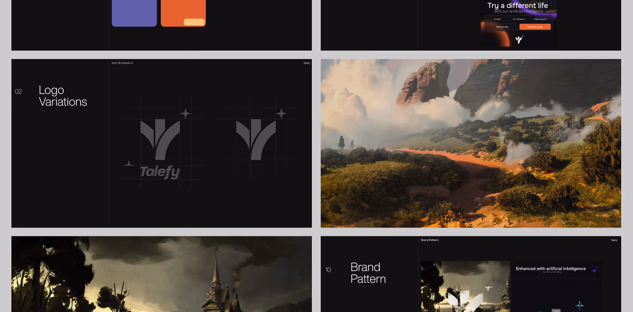
The Logo: metaphor for choice, path, and story
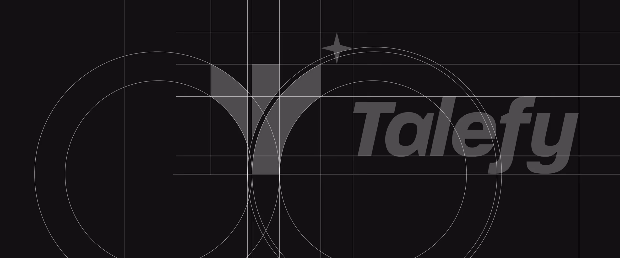
The Talefy symbol was built around a simple but meaningful idea: every story begins with a path — and every path contains a choice. This became the core metaphor behind the logo.
Talefy is a platform where users move through fictional worlds, make decisions, and shape what happens next. In that sense, the logo does not simply represent storytelling as a static book or page. It represents the moment before the story changes — the point where a person chooses a direction. That choice is what creates the experience.
By going through the path, the user either gains something to tell or becomes more experienced through the journey itself. This idea connects directly to Talefy’s product: interactive stories where the user is not just reading, but participating.
The symbol also keeps a close relationship with the name. Instead of creating a separate decorative mascot or overly complex illustration, we focused the mark around the brand name and letterform. This makes the identity easier to remember, easier to associate with the product, and more efficient for long-term brand recognition.
For the broader brand system, small supporting elements can be used as visual anchors. They add atmosphere, rhythm, and recognition without taking attention away from the main experience. This approach allows the brand to feel rich and imaginative while still staying clean, scalable, and product-ready.
The result is a logo that works on two levels: as a simple, recognizable digital mark — and as a deeper metaphor for the journey, choices, and stories that Talefy creates.
What this project taught us
Talefy confirmed something we believe strongly at Postulatum Studio:
- The best brand identities are not built around how a product works.
- They are built around why people want to enter its world.
- Technology can make a product powerful. But brand is what makes it understandable, desirable, and memorable.
In Talefy’s case, the product was not just about artificial intelligence. It was about imagination and emotional participation. Once we understood that, the design direction became clearer.