Design studio
built on knowledge
0%
You can always reach us by email.
We’ll get back to you as soon as possible.
hello@postulatum.studio
Let´s start a conversation
Design Audit
Monthly Design Partner
Project-Based
Art Direction
Branding
Web Design
Packaging
Marketing Content
Creative Direction
3D Graphics
[
Submit
]
Thank you! Your submission has been received!
Oops! Something went wrong while submitting the form.
Building a restaurant identity around elegance, presence, and human connection.
La Belle Étoile was created as a refined hospitality brand for central London, built to express atmosphere, attract the right audience, and turn a new restaurant into a place people would want to enter, remember, and return to.
[ Brand Strategy, Rebranding, Visual Identity, Web Design, Packaging Design ]

Sanders Donuts.
Rebranding a handcrafted donut brand

Challenges

Making a familiar product feel fresh
Standing out in a crowded food category
Balancing playful and credible
Building a system

Ideas

Joy as a brand strategy
Bold typography as appetite language
Color that feels warm and craveable

Results

Brighter and more recognizable brand
A complete digital and retail system
A clearer handcrafted positioning
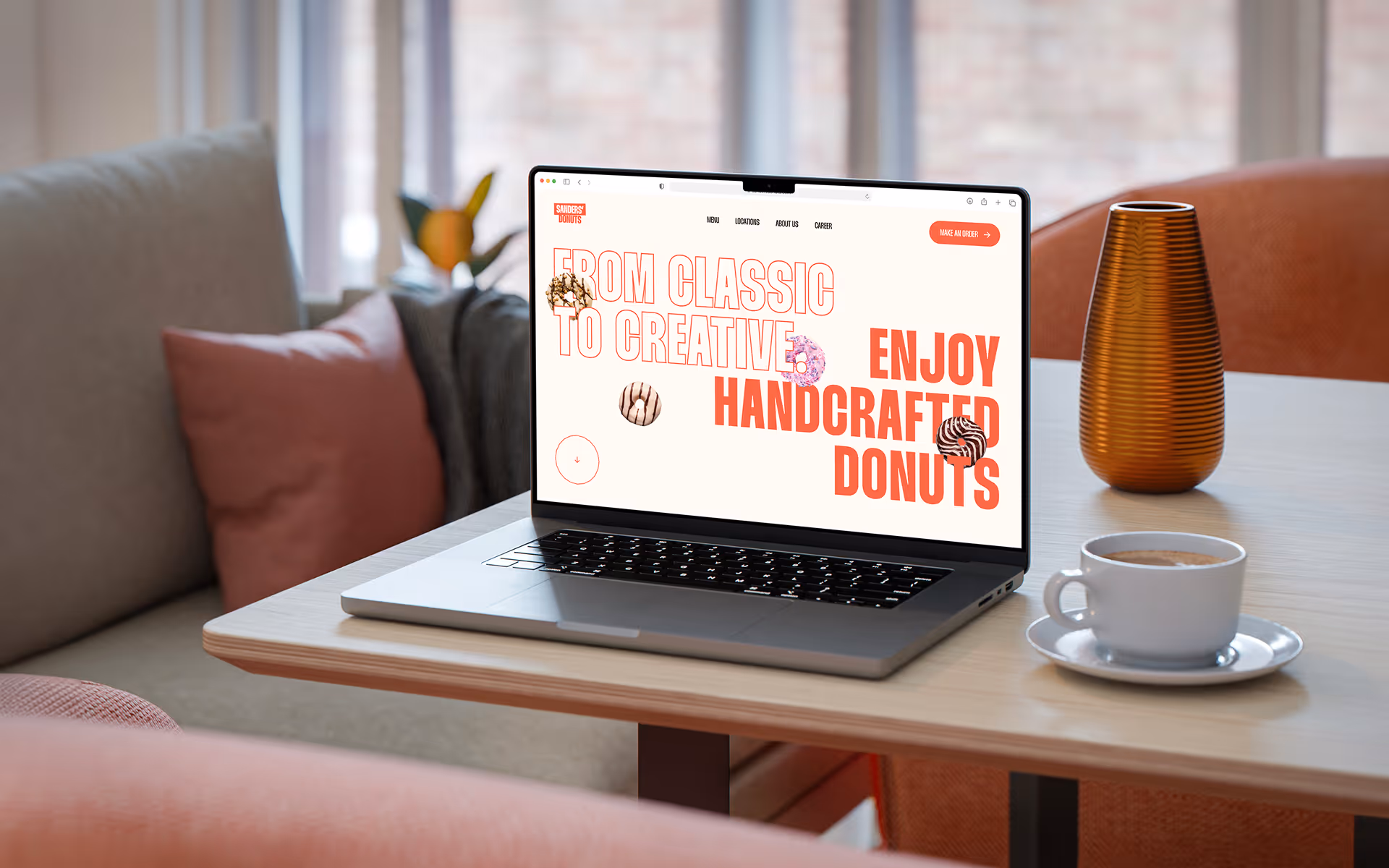
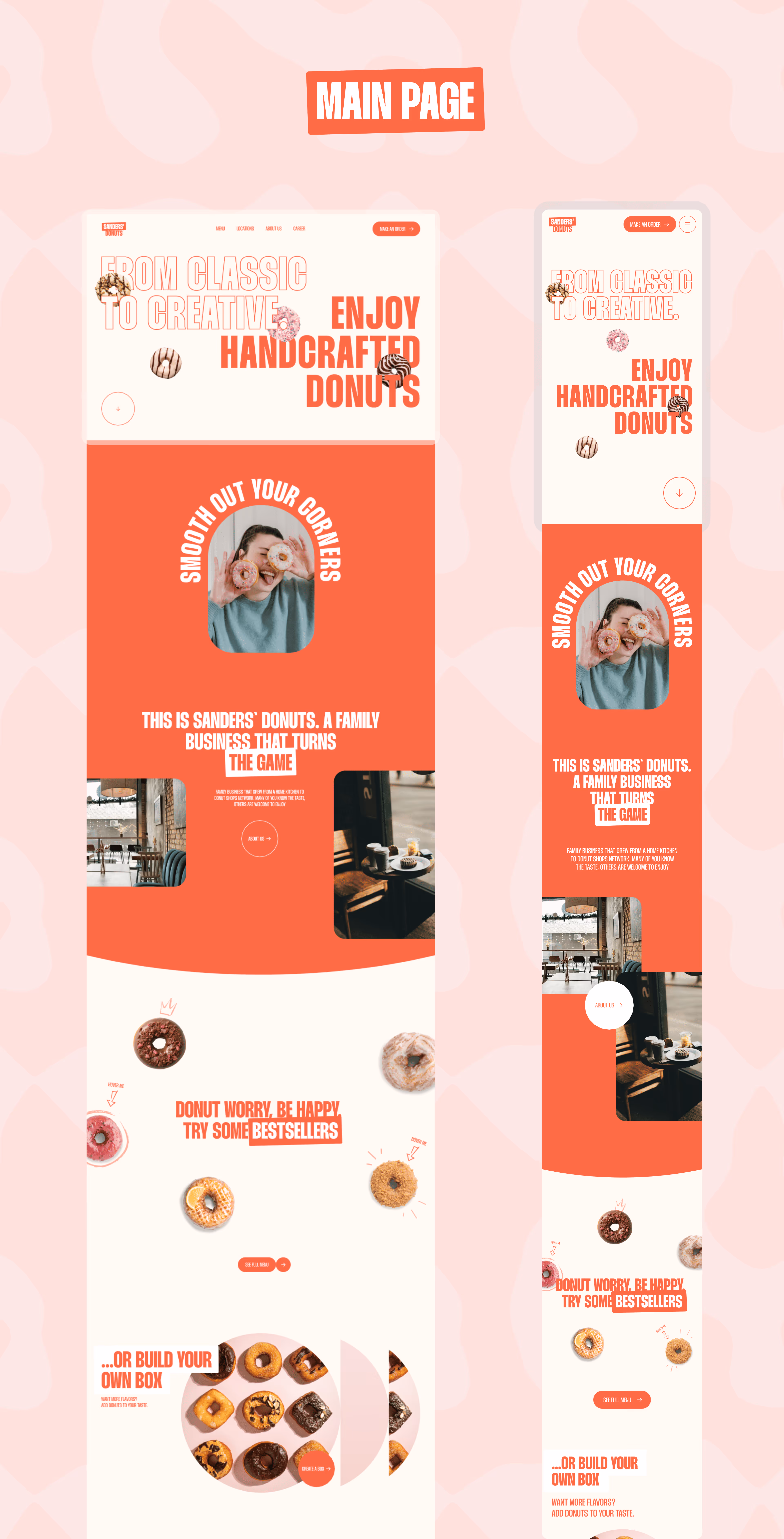
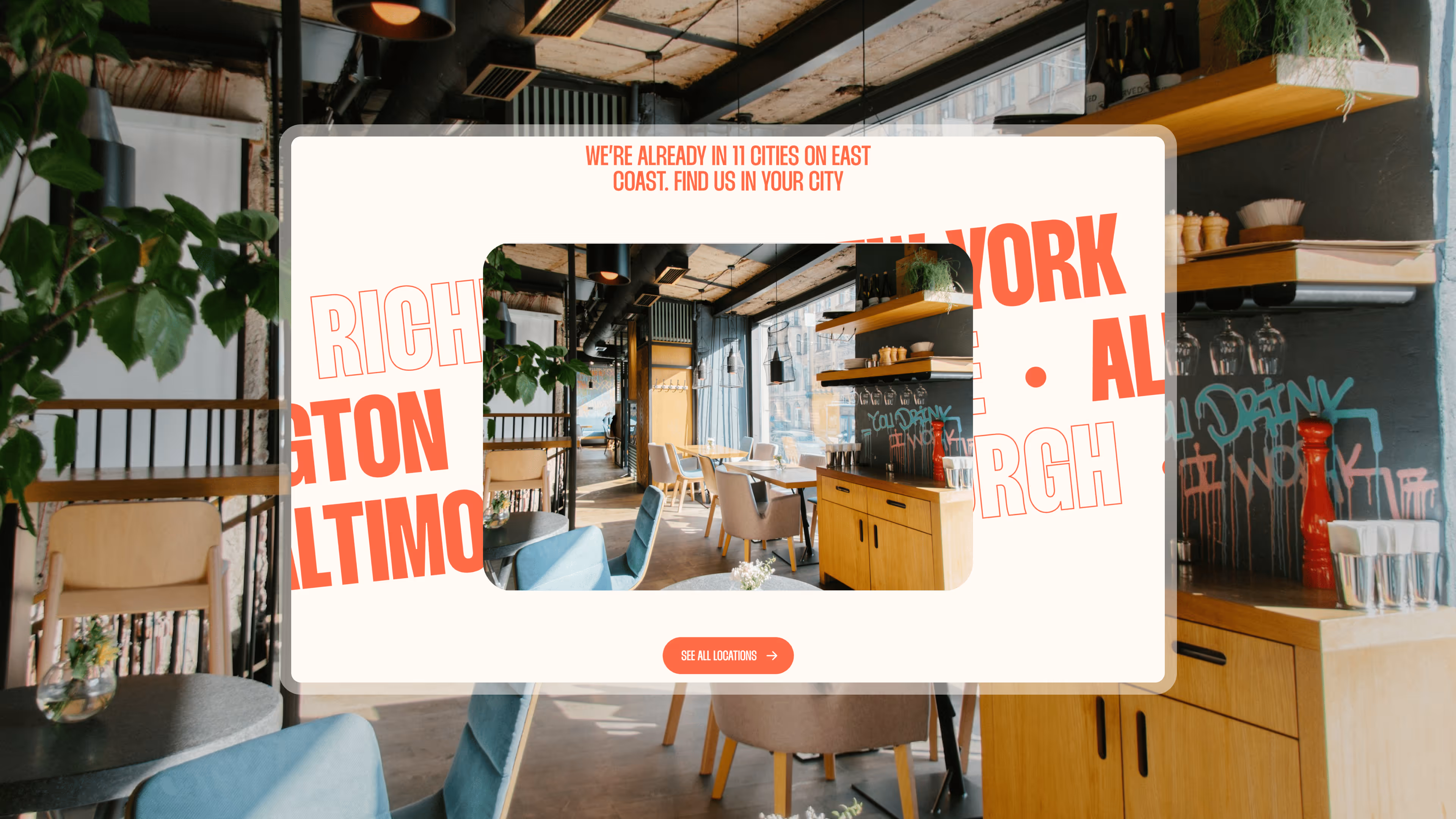
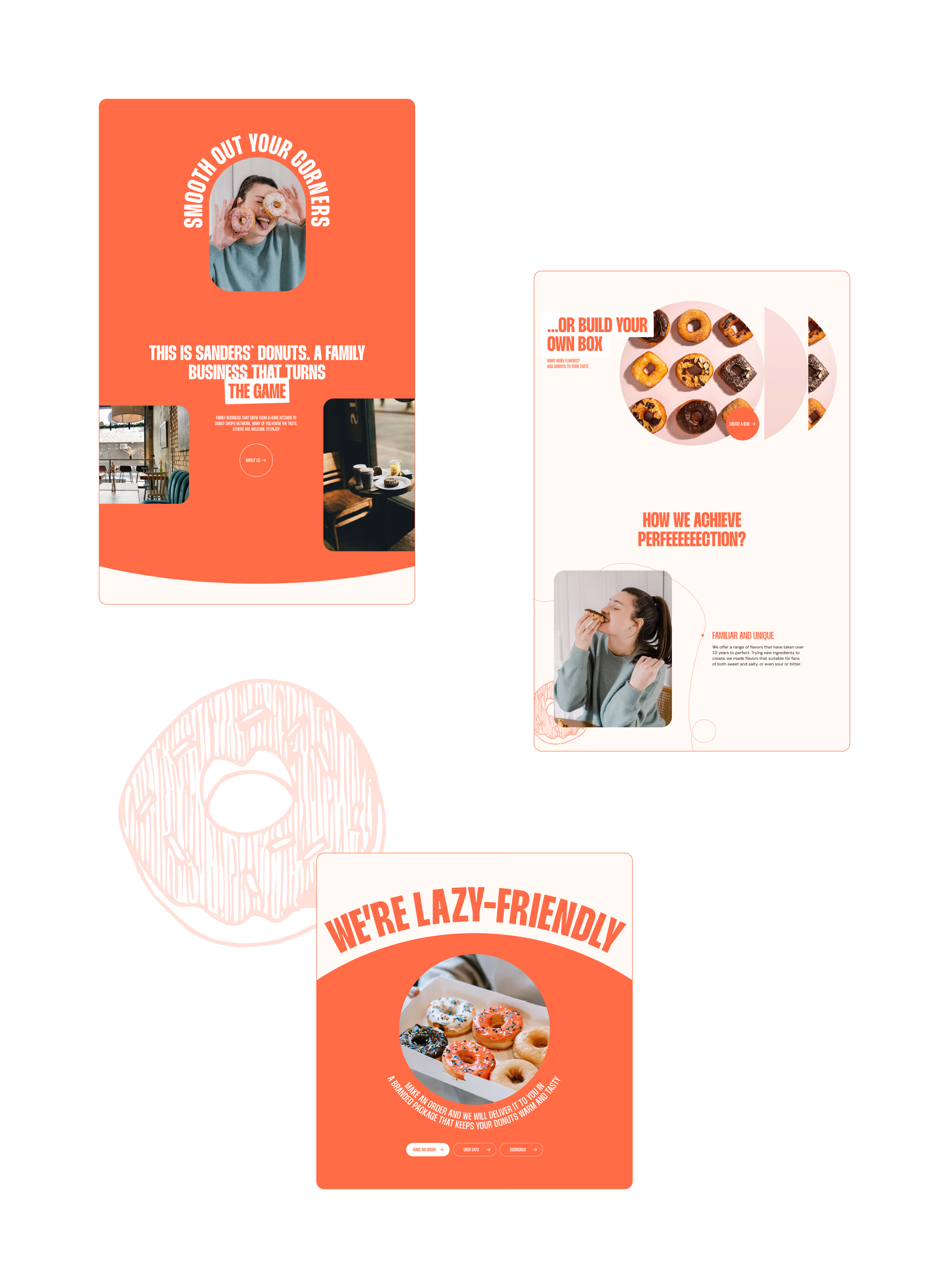
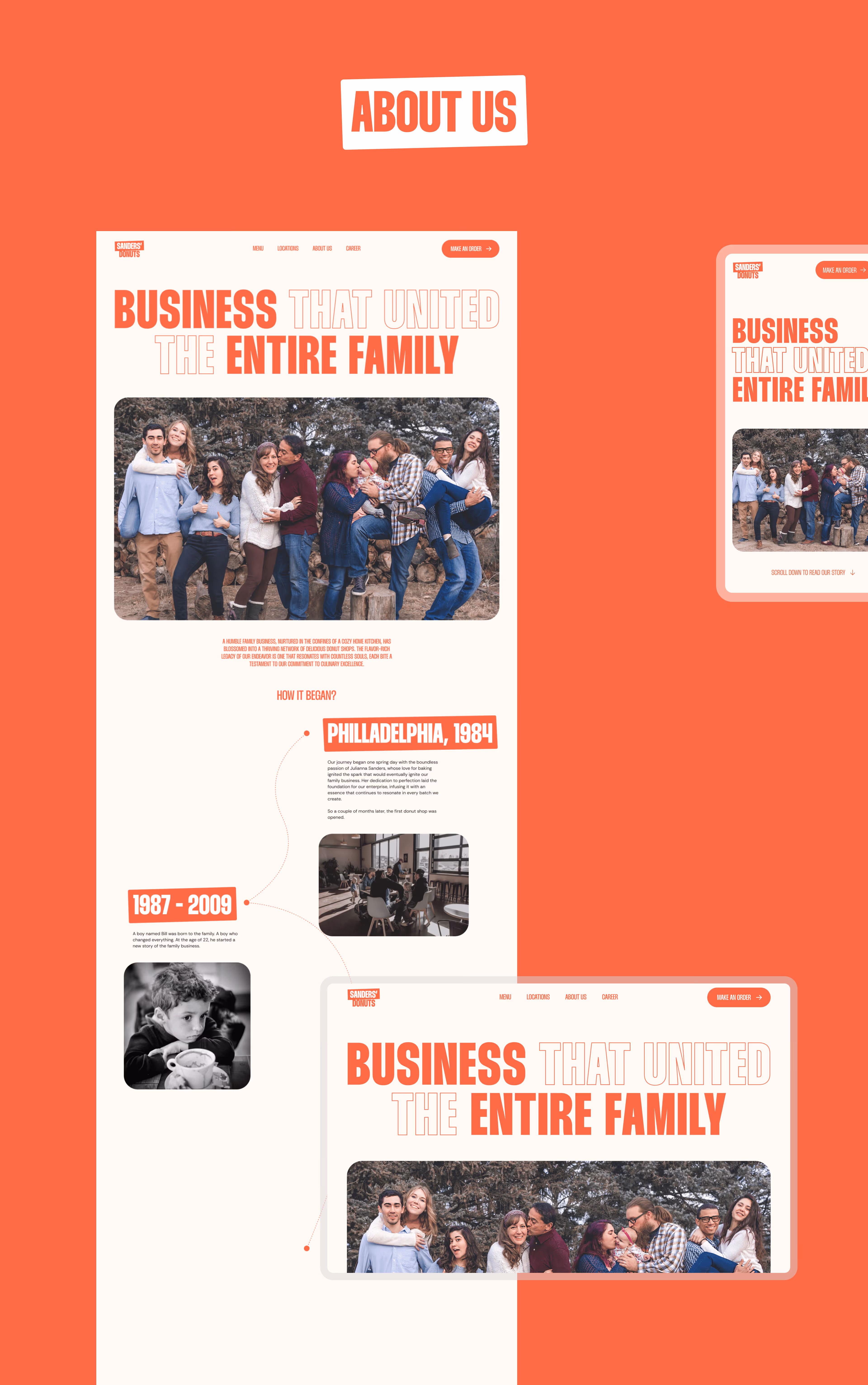
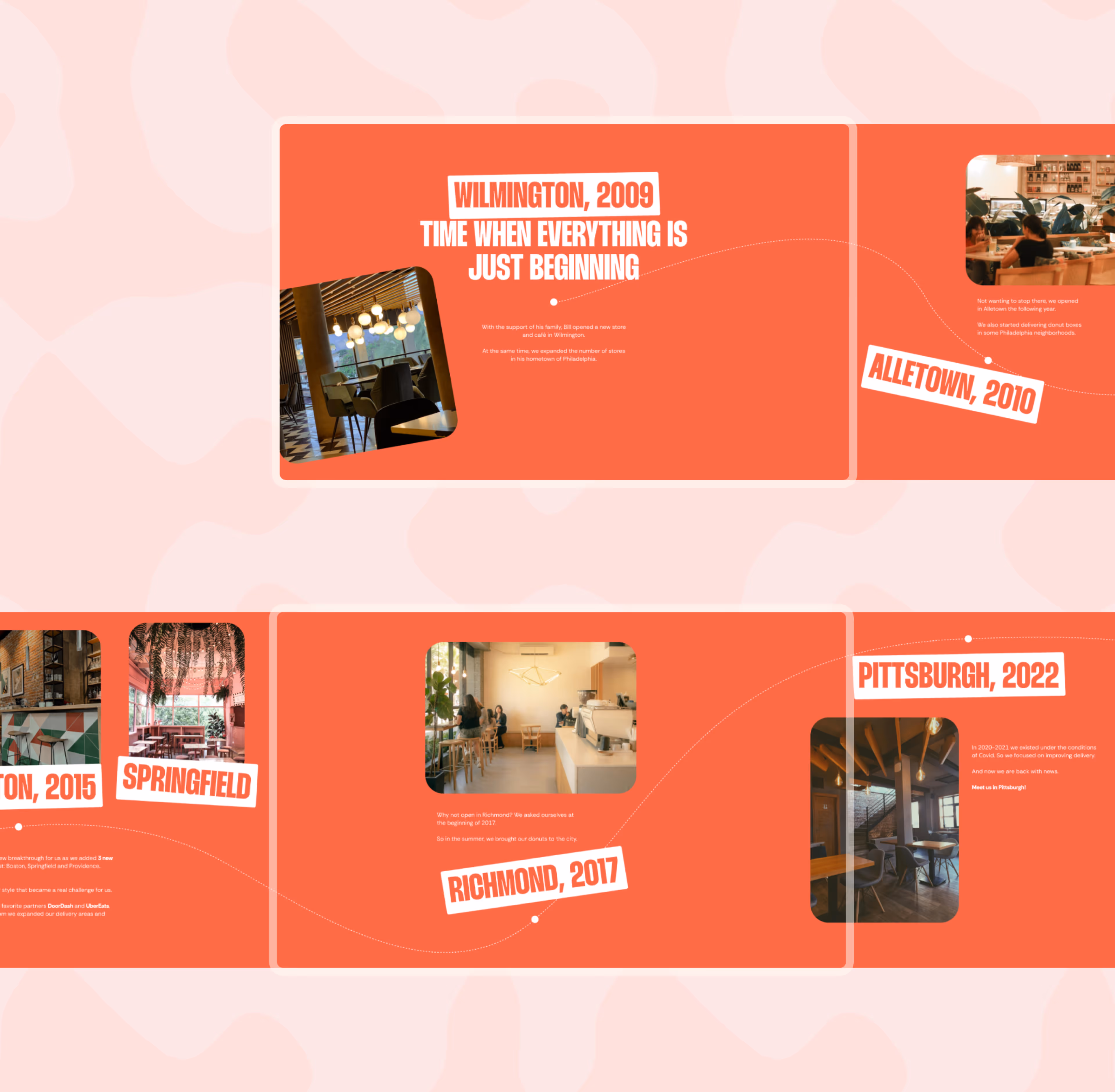
Sanders Donuts was a rebranding project for a handcrafted donut brand that needed a stronger, brighter, and more appetizing visual identity. The goal was to move the brand from a simple food offering into a more memorable experience — one that could work across digital platforms, packaging, menus, retail materials, and customer-facing communication.

The challenge was to make a familiar product feel exciting again. Donuts already carry emotion: comfort, sweetness, reward, nostalgia. Our task was to translate that feeling into a visual system that could feel modern, playful, and commercially useful. The identity had to attract attention quickly, make the product look desirable, and stay flexible across many formats.
Key Ideas:
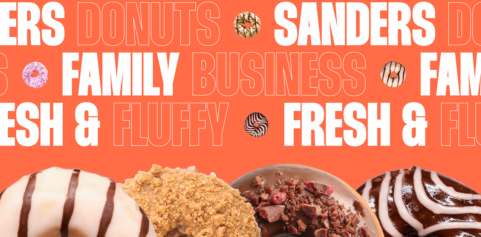
Joy as a business tool
Handcrafted donuts with a bold visual voice
Appetite-driven typography and color
Digital-first food brand communication
A playful system built for recognition
August 2024

The product became the brand’s main emotional trigger

For Sanders Donuts, the visual identity was built around the feeling people already associate with donuts: reward, joy, comfort, and small daily pleasure. Instead of hiding the product behind abstract branding, we made it central to the system.

Have a project that needs design?

We help founders and teams translate ideas, atmosphere, and business goals into design systems that can shape perception, build trust, and support growth.
[
Discuss It
]

Victoria VR.
3D Reward Assets for a Metaverse Campaign

[
Read more
]